
CSS Container Queries – Why I’m using media queries less and less
I’ve been developing websites since 1995. I’ve built HTML table layouts, survived float hacks, and celebrated the introduction of media queries as a godsend. But since I’ve integrated CSS container queries into my workflow, I’ve realised that media queries often solve the wrong problem.
In this article, I explain what container queries are, why they represent a paradigm shift – and when I use which one.
The fundamental problem with media queries
Media queries respond to the viewport – that is, the width of the browser window. For years, this was sufficient, as long as layouts were simple. But modern websites are made up of reusable components: cards, hero sections, product boxes and navigation bars.
And that’s where the problem lies. Imagine a product page. In the main section of the page, it’s 400px wide. In a sidebar, perhaps only 200px. The viewport is the same size in both cases – but your layout is completely different.
With media queries, you’ll need to write something like this:
/* Global breakpoints that know nothing about the container */

@media (max-width: 768px) {
  .product-card {
     flex-direction: column;
   }
}It works – until the card appears in a grid that is itself responsive. Then the breakpoints no longer match. You end up writing exceptions for exceptions. The CSS code becomes confusing, difficult to maintain and closely tied to the layout.
What are container queries?
Container queries flip the logic on its head: instead of responding to the viewport, a component responds to its own container.
First, you define which element acts as the container:
.card-wrapper{
  container-type: inline-size;
  container-name: card;
}Then you write styles that respond to the width of this container – not to the viewport:
@container card (min-width: 400px) {
  .product-card {
    display: flex;
    flex-direction: row;
  }
}

@container card (max-width: 399px) {
  .product-card {
    flex-direction: column;
  }
}The card now knows how much space it has – regardless of where it is placed on the page.
The three main practical benefits
1. True reusability of components
For me personally, that’s the biggest benefit. A component I’ve built once works everywhere – whether in a sidebar, in a grid or as a standalone element. I no longer have to assign context-dependent classes or abuse CSS specificity.
In the past:
.sidebar .product-card {/* Exception styles */}
.main-content .product-card { /* other exception styles */ }Nowadays: The card takes care of that itself.
2. Less JavaScript for layout logic
ResizeObserver
Before container queries, many developers used ResizeObserver or set classes via JavaScript to respond to changes in an element’s size. This approach is prone to errors, comes at a performance cost, and doesn’t really belong in JavaScript.
// I don't need that anymore
const observer = new ResizeObserver(entries =>); Container queries handle this natively in the browser – faster, cleaner and easier to maintain.
3. Styles remain with the component
Anyone who works in a team or picks up projects again after months will be familiar with the problem: CSS styles are scattered across numerous files, global breakpoints override one another, and nobody dares to delete anything anymore.
With container queries, you write the styles directly within the component. Everything the card needs is contained within the card itself. This makes code reviews easier, onboarding quicker and refactoring less risky.
When to use media queries, and when to use container queries?
Both have their place. My rule of thumb:
I use media queries for the main layout – in other words, for the basic structure of the page. When does the navigation switch to a hamburger menu? When does a two-column layout become a single-column layout? These are decisions that depend on the viewport.
I use container queries for components – anything that is reused or can appear in different places within the layout. Cards, teasers, widgets, form elements.
A simple guide to help you decide:
| Situation | Recommendation |
|---|---|
| Navigation, page structure | Media Query |
| Reusable component | Container Query |
| Component in different contexts | Container Query |
| Print styles | Media Query |
| Dark Mode | Media Query (prefers-color-scheme) |
Bonus: Style queries – the next level
Container queries can not only respond to size, but will soon also be able to respond to CSS custom properties – so-called Style Queries:
@container style(--theme: dark) This means that a component can respond to the ‘state’ of its container without the need for JavaScript or additional classes. This is still experimental, but the direction is clear: CSS is becoming more powerful and self-sufficient.
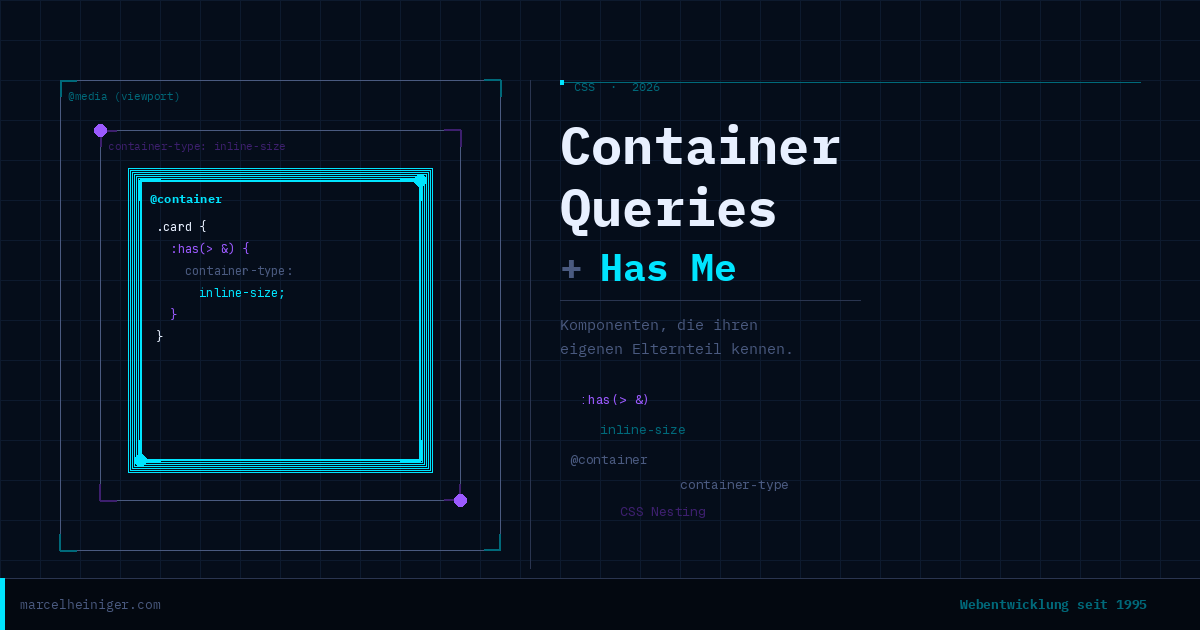
Bonus 2: The ‘Has Me’ selector – container queries without pitfalls
Container queries have a well-known weakness: a component’s direct parent must be declared with `container-type`. If you forget to do this, the container queries simply won’t work.
/* You always have to set this manually – on EVERY parent element */
.sidebar .main-content .some-other-wrapperIn practice, this means that every time you move a component to a new location in the layout, you have to check whether the new parent element is declared as a container. This is prone to errors and a real pain.
The solution: The component declares its parent itself
Kevin Geary has come up with an elegant solution, which he calls the ‘Has Me Selector’. The idea is that, instead of declaring the parent from the outside, the component itself tells its parent:"You must be a container"
This works through a combination of :has(), CSS nesting and the & selector:
.card {
  :has(> &) {
    container-type: inline-size;
  }
}What exactly is happening here? In CSS nesting, the & stands for the current selector – in this case, .card. The & is normally used to apply styles to the element itself or its pseudo-elements:
.card {
  &::hover { /* = .card:hover */}
  &::before { /* = .card::before */ }
}
But you can also do it the other way round. If you write .hero-section &, this means .hero-section .card – so you’re writing global CSS from within the component. That’s the trick.
:has(> &) then means: “Select every element that has .card as a direct child” – in other words: the parent element of .card, whatever it’s called.
The result is the same as:
:has(.card) {
  container-type: inline-size;
}The key difference is that this rule is set automatically by the component. No manual updates, no risk of forgetting. The card takes care of it itself.
<br>Der entscheidende Unterschied: Diese Regel wird automatisch
Complete example
This is what a robust, fully autonomous component with a container query looks like:
.card{
/* Has Me: Parent automatically becomes a container */
  :has(> &) {
    container-type: inline-size;
  }

/* Container queries now work everywhere */
  @container( min-width:400px) {
    display: flex;
    flex-direction: row;
    gap: 1.5rem;
  }

  @container( max-width:399px) {
    flex-direction: column;
  }
}You can place this card in any sidebar, grid or footer – it always works.
Conclusion
Container queries, the ‘:has(> &)’ selector and style queries all point in the same direction: CSS is becoming more self-sufficient, more expressive and is taking on tasks for which we previously needed JavaScript.
My recommendation for new projects:
Media queries for the basic structure and viewport-dependent decisions
Container queries for all reusable components
Include :has(> &) in every component so that it makes its parent the container
Browser support for all three features is excellent today. There’s no longer any good reason not to use them – your future self will thank you for it.
Marcel Heiniger ist Webentwickler aus Ipsach bei Biel und entwickelt seit 1995 Websites.
Er hilft KMUs mit massgeschneiderten WordPress- und WooCommerce-Lösungen.