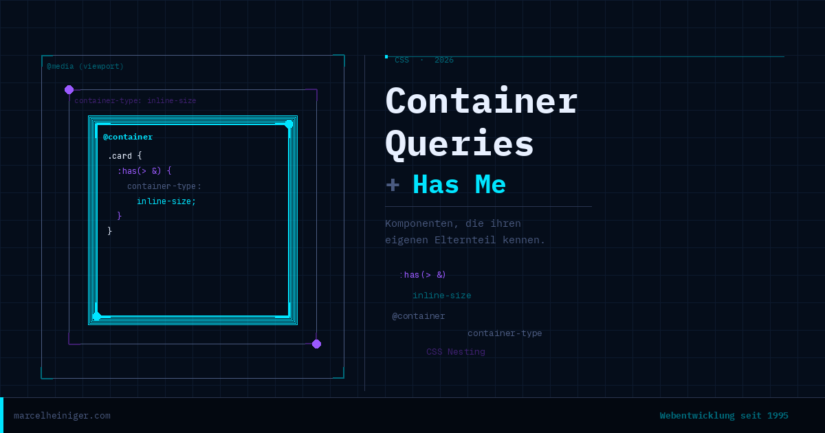
CSS Container Queries – Why I’m using media queries less and less
/* Global breakpoints that know nothing about the container */ @media (max-width: 768px) { .product-card { flex-direction: column; } } /* Global breakpoints that know nothing about the container */…